
The Beauty of Muted Colors in Interior Design

Interior design does not always need bold colors to make an impression. Sometimes, the most beautiful spaces are built around soft, understated shades that quietly create warmth, depth, and character. Muted colors have a subtle quality that allows furniture, textures, patterns, natural materials, and architectural details to work together without competing for attention.
From dusty sage and faded olive to warm beige, muted terracotta, soft charcoal, dusty rose, and earthy brown, these colors can transform a room into a space that feels comfortable, collected, and effortlessly sophisticated.
Muted colors are particularly beautiful when incorporated through rugs. A muted rug can ground a room while introducing pattern, texture, and color without overwhelming the rest of the décor. Whether you prefer vintage-inspired interiors, modern minimalism, rustic spaces, or an eclectic home, muted rugs can provide the visual foundation that brings everything together.
In this guide, we’ll explore what muted colors are, why they work so well in interior design, how to decorate with them, and how muted rugs can help create a home that feels timeless and inviting.
What Are Muted Colors?
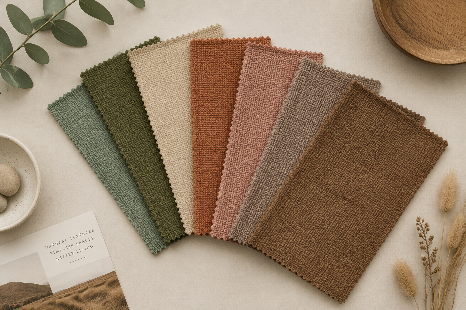
Muted colors are shades that have been softened or toned down rather than appearing extremely bright or saturated. They often have gray, beige, brown, white, or earthy undertones that reduce their intensity.
Unlike highly saturated colors such as bright red, electric blue, or vivid yellow, muted shades feel more understated.
Examples include:
- Sage green
- Olive green
- Dusty blue
- Warm beige
- Taupe
- Soft brown
- Terracotta
- Dusty rose
- Muted mustard
- Warm gray
- Charcoal
- Cream
- Greige
- Faded rust
- Soft clay
Muted colors can still have personality. They simply express it in a quieter way.
This makes them especially useful for interiors because they can introduce color without making a room feel visually busy.
Why Are Muted Colors So Popular in Interior Design?
One of the biggest reasons muted colors remain popular is their versatility.
A strongly saturated color can dominate a room. A muted version of that same color is generally easier to combine with other shades, materials, and patterns.
For example, a vivid green may immediately become the focal point of a room. Sage or olive green can introduce the same connection to nature while feeling much softer.
Similarly, a bright orange can feel energetic and dramatic, while muted terracotta can create warmth and an earthy atmosphere.
Muted colors also work particularly well with natural materials such as:
- Wood
- Wool
- Linen
- Cotton
- Rattan
- Stone
- Jute
- Leather
- Ceramic
- Woven textiles
This makes them ideal for homes that emphasize comfort and natural texture.
1. Muted Colors Create a Sense of Calm

Your home should be a place where you can relax.
Muted colors can help create a visually quieter environment because they tend to have less intensity than highly saturated shades.
Soft beige walls paired with a muted rug, natural wood furniture, and linen textiles can create an atmosphere that feels warm without becoming overwhelming.
This is particularly useful in bedrooms, reading corners, living rooms, and other spaces designed for relaxation.
Instead of immediately demanding attention, muted colors allow your eyes to move naturally around the room.
The result can be an interior that feels peaceful and balanced.
2. They Make a Home Feel More Timeless
Interior trends come and go. Color trends change every year, but muted shades tend to remain relevant because they are adaptable.
A muted palette can evolve with your furniture and accessories.
For example, a beige or taupe rug can work with:
- Contemporary furniture
- Vintage pieces
- Rustic wood
- Modern sofas
- Antique accessories
- Minimalist décor
- Eclectic styling
Instead of designing an entire room around one temporary trend, muted colors give you a flexible foundation.
This is particularly valuable when investing in a handmade rug.
A beautifully crafted rug is something you may want to keep for years. Choosing a sophisticated, muted palette can make it easier to incorporate the rug into different rooms and changing décor styles.
3. Muted Colors Highlight Texture
Color is only one part of an interior.
Texture is equally important, especially when working with neutral or muted palettes.
Imagine a room featuring:
- A textured wool rug
- A linen sofa
- A wooden coffee table
- A woven basket
- Ceramic accessories
- Soft cotton cushions
Because the colors are relatively restrained, the textures become more noticeable.
You begin to appreciate the variation in the wool, the grain of the wood, the softness of the linen, and the subtle pattern of the rug.
This is one reason muted interiors rarely need excessive decoration.
Texture can provide much of the visual interest.
4. Muted Rugs Can Become the Foundation of a Room

A rug is often one of the largest visual elements in a living space.
That means the color and pattern of a rug can influence the entire atmosphere of the room.
A muted rug provides an opportunity to introduce color without making the floor feel visually heavy.
For example, a faded vintage-inspired rug featuring beige, olive, rust, and soft brown can connect several elements within a room.
The sofa might be cream.
The furniture might be walnut.
The cushions might include olive and terracotta.
The rug can quietly bring all of those colors together.
Instead of looking like a separate accessory, it becomes part of the room's overall visual language.
How to Decorate with Muted Colors
Decorating with muted colors does not mean everything needs to be beige.
In fact, the most successful muted interiors usually include several shades and textures.
Here are some ways to create a layered muted palette.
5. Start with a Neutral Foundation
Begin with one or two foundational shades.
These could include:
- Cream
- Beige
- Warm white
- Taupe
- Greige
- Soft gray
- Light brown
These colors can be used for larger pieces such as walls, sofas, curtains, or rugs.
A neutral foundation gives you freedom to introduce additional muted colors through accessories.
For example, a cream sofa can become the foundation for olive cushions, terracotta ceramics, a faded patterned rug, and warm wooden furniture.
6. Add Earthy Muted Colors
Earth-inspired shades are particularly effective because they naturally feel connected to the outdoors.
Consider incorporating:
- Sage
- Olive
- Moss
- Clay
- Terracotta
- Rust
- Sand
- Ochre
- Warm brown
These colors work beautifully with wood and natural textiles.
An earthy muted palette can make a modern home feel warmer and more lived-in.
7. Mix Warm and Cool Muted Shades
A room does not have to use only warm colors or only cool colors.
Combining the two can create balance.
For example, you might pair:
Warm shades:
- Terracotta
- Beige
- Rust
- Cream
- Camel
with:
Cooler muted shades:
- Sage
- Dusty blue
- Soft gray
- Olive
- Muted charcoal
The key is to maintain similar levels of saturation.
A highly saturated color may look out of place in an otherwise soft palette.
Muted Colors and Vintage Interior Design

Muted colors have a natural relationship with vintage-inspired interiors.
Many vintage textiles have a softness that comes from age, traditional dyeing techniques, faded patterns, or deliberate distressing.
Instead of looking perfectly bright and new, the colors can appear gently worn and layered.
This creates a sense of history.
A rug featuring faded rust, beige, muted blue, and olive can instantly make a room feel more collected.
It can also help newer furniture feel less showroom-like.
This is especially useful when decorating modern homes.
A contemporary sofa combined with a vintage-inspired muted rug can create an interesting contrast between old and new.
The result feels personal rather than overly coordinated.
8. Use Muted Patterns Instead of Solid Colors
If you enjoy patterned interiors but don't want a room to feel overwhelming, muted patterns can be the perfect solution.
Instead of a brightly colored geometric design, consider a rug with:
- Faded geometric motifs
- Subtle floral patterns
- Traditional-inspired designs
- Soft stripes
- Abstract shapes
- Distressed motifs
The pattern adds personality, while the muted palette keeps the overall appearance calm.
This approach works particularly well in living rooms and bedrooms.
How Muted Rugs Work with Different Interior Styles
One of the greatest strengths of muted rugs is their adaptability.
Modern Interiors
Pair a muted rug with clean-lined furniture and simple accessories.
A soft beige, gray, or charcoal rug can add warmth without disrupting a minimalist aesthetic.
Vintage Interiors
Choose faded colors and traditional-inspired patterns.
Muted rugs can reinforce the sense of history and character.
Rustic Interiors
Earthy shades such as brown, olive, rust, and beige work naturally with wood and stone.
Bohemian Interiors
Layer muted rugs with woven textiles, plants, cushions, and handcrafted décor.
Scandinavian Interiors
Soft neutrals and faded blues or greens can complement the simplicity of Scandinavian furniture.
Eclectic Interiors
Use a muted rug as the connecting element between furniture pieces and accessories with different colors and styles.
9. Create Contrast with Dark Muted Shades
Muted does not always mean light.
Deep shades such as charcoal, chocolate brown, dark olive, and muted navy can create beautiful contrast.
For example, a charcoal rug can anchor a room with light walls and cream furniture.
A dark olive rug can work beautifully with natural wood and brass details.
The important thing is to balance darker colors with lighter elements so the room does not feel too heavy.
10. Layer Different Shades of the Same Color
One of the easiest ways to create a sophisticated muted interior is to use tonal layering.
Instead of using many unrelated colors, select one family and incorporate several variations.
For example, a green palette could include:
- Soft sage
- Olive
- Moss
- Deep green
A warm neutral palette could include:
- Cream
- Beige
- Taupe
- Camel
- Brown
Tonal decorating creates depth without requiring strong contrast.
11. Combine Muted Colors with Natural Wood
Natural wood and muted colors are an excellent combination.
The warmth of wood complements earthy tones and soft neutrals.
Consider pairing a muted rug with:
- Oak furniture
- Walnut tables
- Wooden chairs
- Cane furniture
- Rattan accessories
The combination creates a relaxed, organic atmosphere.
If your room already contains significant amounts of wood, a muted rug can soften the overall appearance while adding pattern and texture.
12. Use Muted Colors to Make a Room Feel Collected
One of the biggest advantages of muted palettes is that they can make different pieces appear as though they belong together.
Imagine a room containing a vintage side table, a contemporary sofa, a handmade ceramic lamp, a wooden coffee table, and an older-looking rug.
If the colors share similar muted undertones, these different objects can feel connected.
This creates the feeling of a home that has evolved over time.
Instead of looking like everything was purchased together, the room feels collected.
That sense of personality is one of the reasons muted interiors are so appealing.
Muted Colors in Different Rooms

Living Room
The living room is one of the best places to introduce a muted rug.
A large area rug in beige, olive, rust, gray, or soft brown can establish the color palette for the entire room.
Pair it with neutral furniture and add small amounts of complementary color through cushions and artwork.
Bedroom
Muted colors can create a relaxing atmosphere in bedrooms.
Consider soft sage, dusty blue, warm beige, or muted rose.
A textured rug beside or underneath the bed can add comfort while making the room feel warmer.
Dining Room
Muted patterned rugs can add personality beneath a dining table.
Choose a design that provides enough visual interest without competing with tableware or furniture.
Entryway
The entryway is an excellent place for a muted runner.
It can introduce warmth and character as soon as someone enters the home.
Because hallways can be narrow, a subtle pattern can provide interest without making the space feel crowded.
Nursery and Kids' Rooms
Muted colors can also work beautifully in children's spaces.
Soft sage, beige, dusty blue, muted peach, and warm cream can create a gentle environment while still allowing playful details elsewhere in the room.
13. Don't Make Everything the Same Shade
A common mistake when decorating with muted colors is creating a room where every element is nearly identical.
That can make the space feel flat.
Instead, create variation.
If your main color is beige, introduce:
- Cream
- Taupe
- Brown
- Olive
- Terracotta
- Soft gray
You can also vary textures.
For example:
Color: muted
Pattern: subtle
Texture: rich
Materials: varied
This combination creates visual depth without requiring bright colors.
14. Let Your Rug Introduce Multiple Muted Colors
Instead of choosing a completely solid rug, consider a design that combines several understated colors.
A rug might feature beige as the dominant color with small accents of:
- Olive
- Rust
- Charcoal
- Cream
- Dusty blue
This gives you more flexibility when choosing furniture and accessories.
You can pull one or two of those colors into cushions, artwork, curtains, or decorative objects.
The rug essentially becomes a color map for the room.
15. Why Muted Colors Work So Well with Handmade Rugs
Handmade rugs often have subtle variations that make them feel individual.
The texture of the fibers, small variations in pattern, and handcrafted character can become even more noticeable when combined with understated colors.
A muted handmade rug does not need to shout to make an impression.
Its appeal can come from:
- Texture
- Craftsmanship
- Pattern
- Subtle color variation
- Imperfect details
- Natural materials
- A sense of character
This makes muted rugs especially suitable for people who want their interiors to feel personal rather than overly polished.
How to Choose the Right Muted Rug

When selecting a muted rug, consider more than just the color.
Look at Your Existing Furniture
Identify the dominant colors already present in the room.
Your rug should complement rather than compete with them.
Consider Natural Light
A room with limited natural light may benefit from lighter muted shades such as cream, beige, or warm taupe.
A bright room can handle deeper muted colors such as olive, charcoal, rust, or brown.
Think About Pattern
If your furniture is simple, a subtle patterned rug can add character.
If your room already has multiple patterns, choose a quieter rug.
Consider Texture
A muted rug can still be visually interesting because of its texture.
Wool, tufted, woven, and other textured constructions can add dimension to an otherwise simple palette.
Muted Colors Are More Than a Trend
The appeal of muted colors goes beyond seasonal decorating trends.
They reflect a broader approach to interior design: creating homes that feel comfortable, personal, natural, and timeless.
A muted palette gives you room to live.
It allows photographs, books, plants, furniture, artwork, handmade objects, and personal memories to become part of the room without competing with an overly dominant color scheme.
That is why muted interiors can feel so welcoming.
They don't necessarily try to impress immediately.
Instead, they invite you to stay.
Final Thoughts
Muted colors prove that subtle does not mean boring.
Sage, olive, beige, terracotta, dusty rose, soft blue, taupe, charcoal, and earthy brown can create interiors that feel warm, sophisticated, and full of character.
The secret is not simply choosing muted colors. It is learning how to layer them.
Combine different shades. Mix textures. Introduce natural materials. Add vintage-inspired elements. Use patterns thoughtfully. And allow your rug to become part of the visual foundation of the room.
A muted rug can do much more than cover a floor. It can connect colors, soften furniture, introduce texture, and give a room a sense of history.
For a home that feels collected rather than decorated, understated colors can be one of the most powerful tools in your design palette.
At Nostalgic Rugs, we believe that beautiful interiors don't always need to be loud. Sometimes, the quietest details create the strongest sense of home.
Frequently Asked Questions
1. What are muted colors in interior design?
Muted colors are softer, less saturated shades that often contain gray, beige, brown, white, or earthy undertones. Examples include sage, olive, taupe, beige, dusty blue, terracotta, muted rose, and soft brown.
2. Are muted colors good for living rooms?
Yes. Muted colors work especially well in living rooms because they create a calm and flexible foundation. They can also make it easier to combine different furniture styles, textures, and decorative elements.
3. What colors go well with muted colors?
Muted colors pair well with warm neutrals, natural wood, cream, beige, brown, charcoal, soft white, and other earthy shades. The key is to maintain a balanced level of saturation.
4. Are muted colors boring?
Not at all. A muted interior can have plenty of personality through texture, pattern, materials, furniture, artwork, and layered shades. Muted colors simply create a quieter visual foundation.
5. Are muted rugs good for modern homes?
Yes. Muted rugs can soften contemporary furniture and introduce warmth, texture, and character into modern interiors.
6. What is the best muted rug color?
There is no single best color. Beige, sage, olive, terracotta, taupe, brown, charcoal, and dusty blue are versatile choices. The best option depends on your existing furniture, wall color, lighting, and overall design style.
7. Can muted rugs work with colorful furniture?
Yes. A muted rug can actually help balance colorful furniture. If the furniture is bold, choose a rug with understated colors and a relatively subtle pattern.
8. Do muted colors work in small rooms?
Yes. Lighter muted shades such as cream, beige, soft taupe, and pale sage can help a small room feel open and calm. A subtle pattern can add interest without visually overwhelming the space.